
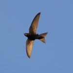
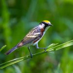
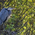
Is there a birder in the United States who is not familiar with the art of Charley Harper? Even if you don’t know his name, the likelihood is that you have seen his minimalist, colorful images on the Migration Mainline poster at the Cape May Bird Observatory or on the numerous posters he created for the National Parks Service (examples grouped below), or on the engaging cards and calendars available in every nature-related book store from the Joppa Flats, Massachusetts to the Huntington Library, California.
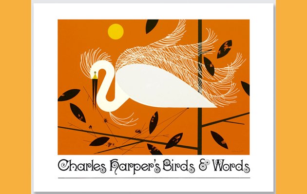
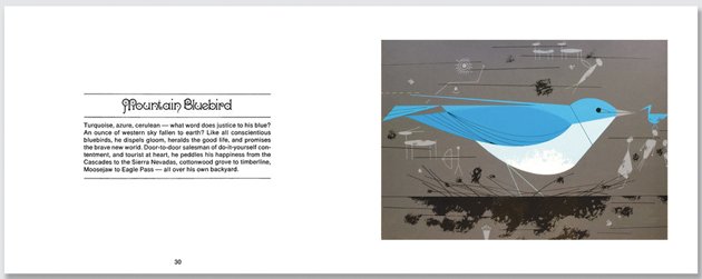
Charles Harper’s Birds & Words is the signature book of this bird and nature artist’s career. First issued in a limited printing in 1972, then re-issued by Ammo Press in 2008 after Harper’s death in June 2007, it contains images that are iconic and familiar, striking and unique. This newest edition celebrates the 40th anniversary of its publication in a large format edition (8.7 by 11.2 inches, approximately 30 percent larger than the original size) that is a far superior platform for Charley Harper’s birds than the more compact editions. These are images that are hard to resist, even for birders enthralled with realism.
Charley Harper (I know the title of this book is Charles Harper’s Birds & Words, but I can’t find any sources that does not call him Charley) came to bird art by way of a farm childhood in West Virginia, an art education at the Art Academy of Cincinnati (he did spend one semester at the Art Students League in NYC, a period which convinced him that he belonged in the Midwest), a World War II stint in the Army, a lifelong partnership with artist Edie McKee Harper, and an open-minded perspective on life and work that embraced trying new styles and techniques without losing a sense of humor. As an independent illustrator, he regularly contributed art to Ford Times, a “lifestyle” magazine published by the Ford Motor Company. Although Ford Times was a company magazine, distributed free to Ford customers, it had a wide circulation, claiming up to 8 million subscribers, and published notable writers and artists. In 1954, art editor Arthur Lougee asked Harper to illustrate an E.B. White article on bird feeding stations. Harper, a farm boy, had never heard of feeding stations and had also, apparently, never before taken a good hard look at birds. He describes his experience in his introduction to Birds & Words:
I took my first good look at birds as subject matter. I didn’t see scapulars, auriculars, primaries, tail coverts, tarsi—none of that. I saw exciting shapes, color combinations, patterns, textures, fascinating behavior and endless possibilities for making interesting pictures. And so I have never counted the feathers in the wings for that is not what my pictures are about. I just count the wings.
And so, “Feeding Station Birds,” an article featuring Charley Harper’s first focus-on-the-birds illustrations, was published in the November 1954 issue of Ford Times. I write ‘focus-on-the-birds’ because it is highly probable that Harper had drawn birds before, but not in a highly focused manner that involved research, which he engaged in very seriously, and observation of bird behavior. A tradition was born. From 1954 to 1960, every November issue of Ford Times featured bird art by Charley Harper. Starting in 1956, Harper wrote the text for the articles as well. Harper contributed artwork to 120 issues of Ford Times, illustrating articles on topics ranging from travel to fish to recipes. But it is the birds for which he is most remembered and the birds that appear to have captured his creative heart.
The Ford Times articles are the core of Birds & Art. Five of its six sections are from the magazine: (1) Western Birds, from the November 1956 issue; (2) America’s Vanishing Birds, from November 1957; (3) Southern Birds, November 1958; (4) American Bird Architects, November 1959; (5) American Bird Census, November 1960; (6) Ten Collector Prints, from the Frame House Gallery Serigraph series. Each section, with one exception, offers images and text of ten birds; Vanishing Birds contains eleven. Each bird illustration consists of two parts–the image itself on the right-hand page full-page size with a wide white border, and the text on the left-hand page, a brief description of the bird in Harper’s distinctive voice. The title font, a swirley, whirley design, echoes Harper’s use of geometric forms and adds a stylish graphic flourish to text and chapter pages. (Graphic artist Todd Oldham writes in the 2008 preface that this font is called “kismet”. I can’t find any kismet-titled fonts that are swirley. If there is a graphic artist out there who knows where to find this font and what it is called, please let us know.)
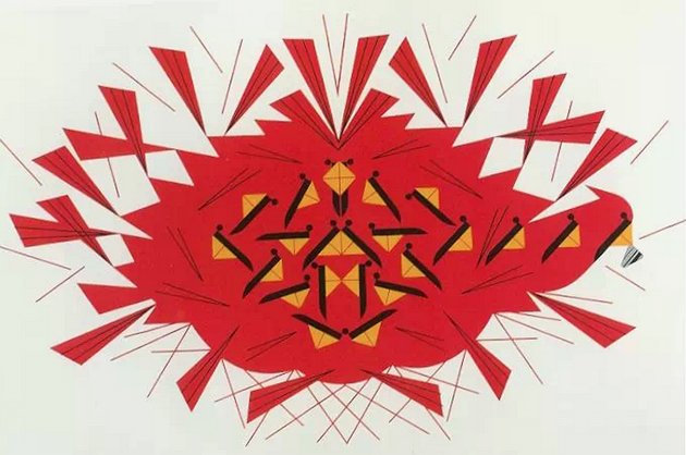
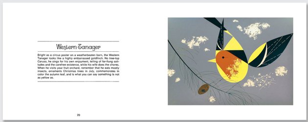
Some of the bird images will be very familiar, especially those of the Northern Cardinal. Harper’s cardinals appear on notecards, calendars, tiles, playing cards, quilts, puzzles; they can be bought as earrings (I have a pair!), salt-and-pepper shakers (no longer for sale, sadly, but sometimes found on eBay), and most recently as small sculptures. There are three cardinal illustrations here, including the abstract-like The Last Sunflower Seed (above). I love cardinals, real and illustrated, but the wonderful thing about this book is that you can also enjoy Harper’s other images, like Western Tanager and Eastern Kingbird. These are good examples of Harper’s art and text. Both appear almost childishly simple on the surface, and reveal layers of surprising information on repeated viewings and readings.
The charm of Charley Harper’s birds lie in their geometric simplicity, their colors, and their design. It’s not just that he has reduced the birds to their basic shapes, he presents them in visually delightful compositions. Color and line define the bird and its habitat, creating vertical and diagonal tensions. Anyone who thinks they could just sit down and draw like Charley Harper is underestimating the expertise that went into developing this style, which he called “minimal realism”. Here is an excerpt from a letter in which Charley describes his technique:
Dropping the 3D and thinking flat, I looked at objects orthographically, which often led to fresh viewpoints and invariably revealed the particular projection that read fastest and made the best design. I reduced all lines and edges to straights and curves (that’s all there are) and began to render with mechanical drawing instruments¬ ruling pen, compass, French curve, T-square, triangle. I saw forms as hard-edge shapes of flat or textured color with enough lines added to complete identification. I began to include black and white in every full-color picture (forbidden in realism); spanning the value scale added sparkle and zip, and all colors seem to me richer in the presence of black and white. I didn’t discard depth, but achieved it by such devices as overlapping shapes and color and size relationships. (b)
He started experimenting with silk screening to produce most of his designs, including the images in Birds & Art. Harper cites the experience as being extremely frustrating, but ultimately the most appropriate art form for his work. The silk screen process produced rich, two-dimensional images, and its limitations ironically helped him reach greater simplicity of form. (c)
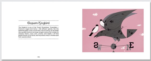
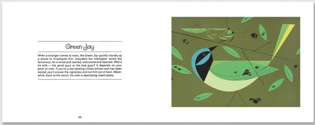
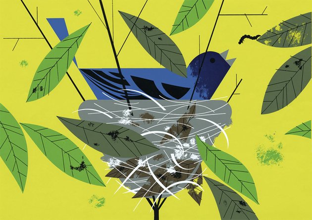
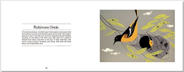
Harper liked to say that he couldn’t draw birds from observation, they moved too fast. He used illustrations from field guides (crediting Don Eckelbery’s illustrations as his first inspirational source) and studied skins. Unlike field guide images, his illustrations are not meant to be instructive. Yet, it is amazing how many identification features are evident in his bird pictures—the fire-red head, streaked back, white wing bars, and white-tipped tertials of the Western Tanager, the white tail band on the Eastern Kingbird, the black-bordered white eyebrow of the Red-eyed Vireo. Harper’s bird knowledge is evident in the habitats in which he places his birds and in their portrayed behavior. Eastern Kingbirds perch on the tallest spot in the area, a weather vane. A Spotted Towhee eats a berry head down, he has obviously just picked it off the ground. A Baltimore Oriole peers out of her hanging basket nest at her mate, while a male Indigo Bunting sings from his cup-like nest balanced in the branches of a shrub.
Not all the illustrations are total successes. The Mockingbird is too brown. The Limpkin image lacks the awkward curvature of the bird’s neck and heaviness of its bill. A female Ruby-throated Hummingbird is depicted; a nice change from the usual males, but visually far less vibrant. The Roseate Spoonbills are portrayed from the top down, which allows for a lovely representation of those spoony bills but sidesteps their fluffy pinkness. And, although I enjoy the circles and oblongs and subtle colors that define this Cactus Wren, it took me quite a while to figure out that it is pecking at a skull in the desert! Still, art being much more subjective than scientific illustration, I suspect that other birders will look at these images and tell me I’m wrong, that they hate the Eastern Kingbird (too pink!) and love the Limpkin.

The text, the “words” of the title, are a combination of factual detail, wit, and whimsical imagery. At their best, they offer selected facts plus a metaphorical picture of the bird in action or in its habitat, often with a twist. So, the Eastern Kingbird “is one of the Tyrant Flycatchers, Tyrannidae–America’s largest bird family–365 different species.” It is also a “feathered gadfly…less a tyrant than a foe of tyranny, for he strikes like a guided missile at any larger winged creature that violates his airspace.” (It took me two readings to get the word play on Tyrant Flycatcher; I’m not sure if I was underestimating Harper’s cleverness or taking my reviewing too seriously.) At their worst, anthropomorphism takes over and the text goes into the dreaded area of cute. The Western Tanager “sings for his own enjoyment, telling of far-flung solitudes and the carefree existence, while his wife does the chores”; the Mockingbird’s “moonlight sonata is likely to be punctuated by variations on a theme from a power mower and Mrs. Catbird’s conversation with Mr. Wren.” Thankfully, the cuteness peters out as the years progress, and concerns with conservation start becoming evident.
America’s Vanishing Birds, my favorite section, is the first chapter that deals with bird extinction and conservation. The text is light on whimsey, but Harper doesn’t shy away from irony. The Carolina Paroquet (this is how the name appears in the book) “was fond of fruits and seeds, a safe diet until the white man planted orchards and grainfields. After that the Paroquet spent his days, which ended in 1904, as a highly visible target.” The Labrador Duck “is memorialized by forty-four stuffed specimens in museums and by countless antique featherbeds.” In some cases, the bird’s path to extinction is stated in haunting brevity. The Eskimo Curlew “ran the gauntlet of a hunter army, which stalked him from state to state to provision meat counters by the wagonload.” Many of these images were new to me; with the exception of the Ivory-billed Woodpecker, I don’t think they have been heavily mined for notecards or fabric. The birds’ images are large and fill the frame, as if to emphasize the fact that someday there may only be one. The chapter also gives hope. Remember, these “vanishing birds” were selected in 1957. Some were already gone, some, like Whooping Crane, are still in danger. But there are species here, like Trumpeter Swan and Snail Kite (called Everglade Kite), that are no longer considered endangered. It’s a good feeling, to see that there has been a little progress.
Charley Harper passed away in 2007 at the age of 84. Although he was well-known in his native Midwest and to birders, he reached national prominence right before his death and then posthumously through the efforts of Todd Oldham. Oldham not only recognized Harper’s achievements as a master graphic artist, he realized that here was a man who had successfully combined a passion for art and nature with a commercially successful career. With Harper’s cooperation, he compiled and designed Charles Harper: An Illustrated Life (AmmoBooks, 2007), a 424-page, $200 coffee table book/art monograph that showcased Harper’s lifetime of illustration–the birds, the murals, the paintings, the posters, even his illustrations for the a 1958 Betty Crocker cookbook. This book, which is now available in a smaller, more affordable edition, includes the bird art from Birds & Words, but not the words.
An Illustrated Life received a lot of media attention when it was published. Oldham’s licensing of Harper’s images to businesses like Old Navy and the estate’s marketing of his prints and spin-off merchandise through the Charley Harper Studio have continued to keep Charley Harper images visible to birders and the general public. The question is, at what point does this type of marketing cross the line from celebration of a joyous vision of birds to commodification, even exploitation, of a dead artist’s legacy? It’s a tricky question, a slippery slope, and I don’t have a ready answer. I write slightly ironically about bird sculptures based on Charley Harper’s images, and at the same time I am looking at the price and wondering if I can afford one. (They are just so damned cute! In a very non-cute way.) We birders love our bird artists and we want them to make a living. I just don’t know how far that extends to posthumous marketing.
In the meantime, we have Charles Harper’s Birds & Words, a very happy book of bird art and text. If you have not bought the 2008, smaller edition and need to choose between the two, I definitely recommend this newer, larger Anniversary edition. Not only are the larger pages more suited for these stylized images, the paper used for the book is glossier and easier to view. Charley Harper’s birds just jump off the page with vibrancy. Also, in some cases the color appears to be better, less dark and murky (the Limpkin in my edition of the 2008 book is so dark I can barely make out the bird). The retail price is not cheap, but it can be found at good discounts from the usual sources. And, unlike a field guide, Birds & Words is the kind of bird book you could give to a non-birding family member and still enjoy yourself, guilt-free. There are many ways in which a birder can enjoy the art of Charley Harper these days. Sometimes it’s good to bypass the mugs and the calendars and indulge in a classic, a good old-fashioned art book.
—————————————–
Sources:
In addition to Charley Harper’s introduction to Birds & Words, “I Just Count the Wings”, the following online articles were very useful in writing this review:
(a) The Charley Harper Gallery offers a detailed history of Harper’s work for the Ford Times, Ford Times Retrospective: http://www.charleyharperprints.com/products-page/ford-times-retrospective/
(b) The Charley Harper Gallery also reprints a detailed letter from Harper to “Mr. Hannah” detailing his development as an artist: https://www.charleyharperprints.com/charley-harper/his-story-in-his-own-words/
(c) Codex 99, a blog on graphic art and artists, has an excellent 7-part article on Charley Harper: http://www.codex99.com/illustration/35.html
(d) Charley Harper talks about his creative process and his use of field guides and skins in an interview with Diane L. Tessaglia-Hymes that originally appeared in the Cornell Lab of Ornithology’s newsletter Birdscope, Spring 2006, http://www.birds.cornell.edu/Publications/Birdscope/Spring2006/world_birds.html
(e) Details and circulation figures for the Ford Times can be found in The Public Image of Henry Ford by David Lanier Lewis, Wayne State University Press; 1987; fortunately these pages are available online through Google Books.
—————————————-
Charles Harper’s Birds and Words (Anniversary Edition)
by Charley Harper.
Ammo Books; Anniversary ed edition; November, 2013 (originally published 1972, reissued 2008)
Hardcover, 152 pages. $34.95.
ISBN-10: 1623260167; ISBN-13: 978-1623260163; Product Dimensions: 8.7 x 11.2 x 0.8 inches


This book is great, I love Charles Harper! His art is very unique and recognizable. I hate that the RSPB is selling similar rip off designs in their last 2 catalogues. Shame on them they should know better than sell copies cats. I wrote about this on my blog: http://fair-isle.blogspot.co.uk/2013/11/birdy-art-or-charles-harper.html